


This article explains the overall approach to building booking forms in “Advanced mode,” where you compose the form with shortcodes and simple layout tags.
- What is Advanced mode?
- Prerequisites & where to edit
- Layout tags (rows, columns, labels, spacer)
- The required [calendar] field
- How fields (shortcodes) work
- Option titles vs saved values (Title@@Value)
- Reserved field names (time & duration)
- Live “hint” outputs vs final outputs
- Conditional display by weekday/season
- Multilingual sections (WPML/qTranslate)
- Validation & special CSS classes
- Fields allowed only once per form
- Styling with id / class
- “Content of booking fields data”
- Starter templates
- Troubleshooting & best practices
1) What is Advanced mode?
Advanced mode lets you assemble the booking form with CF7‑style shortcodes and lightweight layout tags. You decide the structure (rows/columns) and insert field shortcodes where you want them to appear. This approach is powerful, fast, and copy‑paste friendly.
2) Prerequisites & where to edit
- Go to Booking → Settings → Form.
- Switch to the form you want to edit (or create a new one).
- Make sure you’re in the Advanced (shortcode) configuration area.
- For live pricing/date hints, ensure JavaScript/front‑end is not blocked by caching/minify conflicts.
3) Layout tags (rows, columns, labels, spacer)
Use these HTML‑like helpers to build a clean grid without heavy markup:
<r>...</r>– a row (can hold 1–3 columns)<c>...</c>– a column (put labels/fields inside)<l>...</l>– a label wrapper for consistent styling<spacer>...</spacer>– spacing; content can be inline CSS likeheight:10px;orwidth:1em;
<r>
  <c><l>First Name (required):</l><br> [text* name]</c>
  <c><l>Last Name:</l><br> [text secondname]</c>
  <c><l>Email:</l><br> [email* email]</c>
</r>
<spacer>height:10px;</spacer><c> (e.g., flex, padding) for quick layouts.4) The required [calendar] field
The calendar is mandatory—no calendar, no dates, no booking. At least one [calendar] must be present:
[calendar]You can target specific resources (IDs) if enabled:
[calendar] [calendar id=2] [calendar id=3]5) How fields (shortcodes) work
A field shortcode has a type and a name (slug). Examples:
[text* name]           <!-- required text -->
[email* email]         <!-- primary visitor email (must exist) -->
[textarea details]     <!-- multi-line input -->
[selectbox visitors "1" "2" "3" "4"]- Required: add
*right after the type (e.g.,[text* ...]). - Naming: choose unique, simple names (lowercase, no spaces):
name,secondname,phone. - Output: in emails/listing, use the field name inside brackets to print its value (e.g.,
[name]).
6) Option titles vs saved values (Title@@Value)
Choice fields (selectbox/checkbox/radio) accept human‑readable titles but can store strict values using "Title@@Value" syntax.
[selectbox room_type "Single Room@@SGL" "Double Room@@DBL" "Suite@@STE"]
[room_type_val]  → "Double Room"
[room_type] → "DBL"7) Reserved field names (time & duration)
For time‑aware bookings, these names are special and should be used exactly:
rangetime— time ranges via selectbox, values asHH:MM - HH:MM(24h)starttime— start time (text or selectbox), valueHH:MMendtime— end time (text or selectbox), valueHH:MMdurationtime— duration (selectbox), valueHH:MM
[selectbox rangetime "10:00 AM - 12:00 PM@@10:00 - 12:00" "12:00 PM - 02:00 PM@@12:00 - 14:00"]
[selectbox starttime "8:00 AM@@08:00" "8:30 AM@@08:30"]
[selectbox endtime   "5:00 PM@@17:00" "6:00 PM@@18:00"]
[selectbox durationtime "30 min@@00:30" "1 hour@@01:00"]08:00 or 10:00 - 12:00.8) Live “hint” outputs vs final outputs
Hints are live, read‑only labels you place in the form to preview selections & prices. Final outputs are used in emails and booking details.
Live hints (in‑form)
- Prices:
[cost_hint],[original_cost_hint],[additional_cost_hint],[deposit_hint],[balance_hint],[coupon_discount_hint] - Dates/times:
[check_in_date_hint],[check_out_date_hint],[selected_dates_hint],[start_time_hint],[end_time_hint],[days_number_hint],[nights_number_hint], etc. - Resource/availability:
[resource_title_hint],[capacity_hint]
Final outputs (emails/listing)
Use the field names (e.g., [name], [email]) and static info like [bookingresource show='title'], [bookingresource show='cost']. For coupons: [discount].
9) Conditional display by weekday/season
Dynamically swap parts of the form based on which date the user selects.
[condition name="weekday-condition" type="weekday" value="*"]
  Default: [selectbox rangetime "10:00 - 11:00" "11:00 - 12:00"]
[/condition]
[condition name="weekday-condition" type="weekday" value="1,2"]
  Mon/Tue: [selectbox rangetime "10:00 - 12:00" "12:00 - 14:00"]
[/condition]

[condition name="season-times" type="season" value="High_season"]
  High season: [selectbox rangetime "10:00 - 12:00" "12:00 - 14:00" "14:00 - 16:00"]
[/condition]10) Multilingual sections (WPML/qTranslate)
Create language‑specific blocks right inside the form config:
[calendar]
<p>First Name: [text* name]</p>

[lang=fr_FR]
[calendar]
<p>Prénom : [text* name]</p>
And register arbitrary strings for translation with WPML:
[wpml]Some Text to translate[/wpml]11) Validation & special CSS classes
- Required: add
*after type:[text* name] - Email confirmation: second field must match primary via class:
[email* email_verify class:same_as_email](primary name isemail) - Digits only:
class:validate_as_digitor exact lengthclass:validate_digit_9,class:validate_digit_5, etc.
12) Fields allowed only once per form
[captcha][country][coupon discount][cost_corrections](admin Add‑booking only)[submit "…"](recommended one logical submit)
13) Styling with id / class
Most generated fields support optional HTML id and class attributes via the tag generator.
[text phone id:phone_input class:input input--lg]Add your CSS in theme styles or a customizer. Use <l> for consistent label styling.
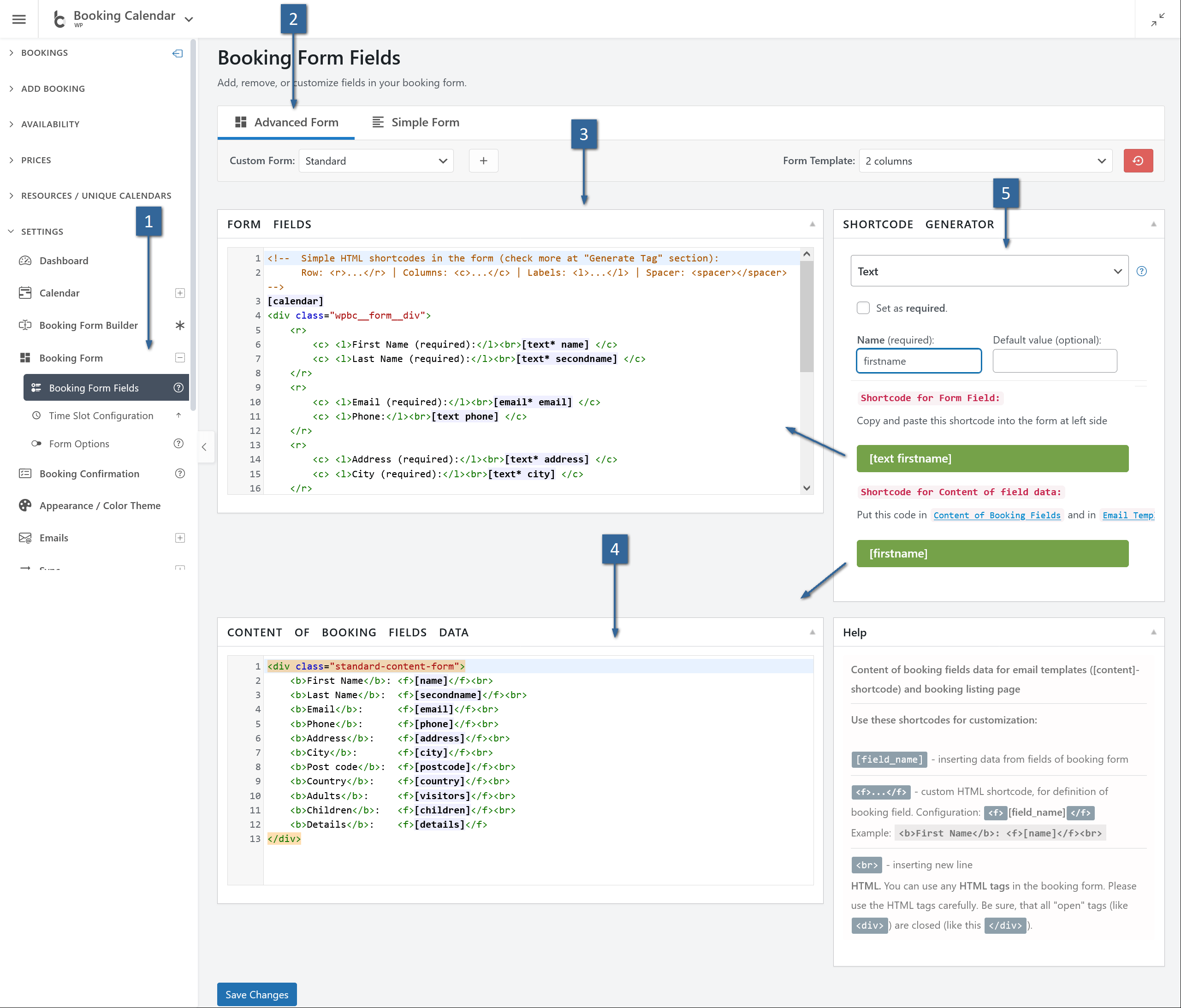
14) “Content of booking fields data”
Configure how submitted data appears in the Booking List and in emails. Use field names inside brackets:
<div class="standard-content-form">
  <b>First Name</b>: <f>[name]</f><br>
  <b>Last Name</b>:  <f>[secondname]</f><br>
  <b>Email</b>:      <f>[email]</f><br>
  <b>Phone</b>:      <f>[phone]</f><br>
  <b>Adults</b>:     <f>[visitors]</f><br>
  <b>Children</b>:   <f>[children]</f><br>
  <b>Details</b>:    <f>[details]</f>
</div>..._hint) only inside the form. In emails/listings, use final outputs (field names and static resource shortcodes).15) Starter templates
Single‑step form (simple)
<r>
  <c>[calendar]</c>
  <spacer>width:40px;</spacer>
  <c>
    <r><c><l>First Name (required):</l><br>[text* name]</c></r>
    <r><c><l>Last Name (required):</l><br>[text* secondname]</c></r>
    <r><c><l>Email (required):</l><br>[email* email]</c></r>
    <r><c><l>Adults:</l><br>[selectbox visitors "1" "2" "3" "4"]</c></r>
    <r><c><l>Details:</l><br>[textarea details]</c></r>
    <r><c>[checkbox* term_and_condition use_label_element "I Accept term and conditions"]</c></r>
    <r><c>[captcha]</c></r>
    <hr />
    <r><c>[submit "Send"]</c></r>
  </c>
</r>
Step‑by‑step (wizard) with live hints
<div class="wpbc_wizard__border_container">
  <div class="wpbc_wizard_step wpbc_wizard_step1">
    <r>
      <c style="flex:1 1 160px;padding-right:20px;border-right:1px solid #ccc;">
        <l>Select Service *</l><br/><spacer>height:22px;</spacer>
        [selectbox durationtime "Service A (20 min)@@00:20" "Service B (30 min)@@00:30"]
      </c>
      <c style="flex:1 1 70%">
        <r style="gap:30px">
          <c><l>Select Date *</l><br/>[calendar]</c>
          <c><l>Select Time *</l><br/>[selectbox starttime "09:00" "09:30" "10:00"]</c>
        </r>
      </c>
    </r>
    <r><c>Date: <strong>[selected_dates_hint]</strong> | Time: <strong>[start_time_hint]</strong></c>
       <c>Total: <strong>[cost_hint]</strong></c></r>
    <r><c class="wpbc_aling_right"><a class="wpbc_button_light wpbc_wizard_step_button wpbc_wizard_step_2">Next</a></c></r>
  </div>

  <div class="wpbc_wizard_step wpbc_wizard_step2" style="display:none">
    <r><c><l>First Name *</l><br/>[text* name]</c><c><l>Last Name *</l><br/>[text* secondname]</c></r>
    <r><c><l>Email *</l><br/>[email* email]</c><c><l>Phone</l><br/>[text phone]</c></r>
    <r><c><l>Details</l><br/>[textarea details]</c></r>
    <r><c>[checkbox* term_and_condition use_label_element "I Accept term and conditions"]</c><c>[captcha]</c></r>
    <r><c class="wpbc_aling_right"><a class="wpbc_button_light wpbc_wizard_step_button wpbc_wizard_step_1">Back</a> [submit "Send"]</c></r>
  </div>
</div>
16) Troubleshooting & best practices
- Calendar missing? Add
[calendar]. Without it, date selection won’t work. - Primary email required: Include
[email* email]so notifications can be sent to visitors. - One‑per‑form fields: Don’t duplicate
[captcha],[country],[coupon discount],[cost_corrections]. - Time values strict: Use 24h format for
starttime/endtimeandrangetimevalues. - Use Title@@Value: When labels differ from machine values (e.g., “8:00 AM@@08:00”).
- Live vs final: Use
..._hinttags in the form; use final outputs (field names, resource shortcodes) in emails/listings. - Conditions: Always include a default
value="*"block; enable single‑day mode. - Validation: For confirmation email, add
class:same_as_emailto second field; for digits useclass:validate_as_digitorclass:validate_digit_9. - Legend: Place
[legend_items]near the calendar for clarity. - Testing checklist: Select dates → times → options → verify live totals → submit → confirm email/listing outputs.